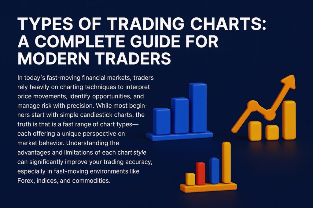
Types of Trading Charts: A Complete Guide for Modern Traders | DAK Markets
In today’s fast-moving financial markets, traders rely heavily on charting techniques to interpret price movements, identify opportunities, and manage risk with precision. While most beginners start with simple candlestick charts, the truth is that there is a wide range of chart types—each offering a unique perspective on market behavior. Understanding the advantages and limitations of each chart style can significantly improve your trading accuracy, especially in fast-moving environments like Forex, indices, and commodities.
At DAK Markets, we provide advanced charting tools across cTrader and our multi-asset trading infrastructure, allowing traders to choose the chart type that best matches their strategy. In this guide, we break down the most commonly used chart types: Candlestick, Bar, Renko, Range, Tick, and Heikin Ashi.
Why Chart Selection Matters in Trading
Charts are not just visual tools—they shape how you interpret price, identify trends, and measure volatility. Many traders fail not because their strategy is bad, but because they are using the wrong chart type for the market conditions they are trading.
Choosing the right chart can help you:
- Filter out market noise
- Better visualize trends
- Read price action with more clarity
- Spot entries and exits more effectively
- Align with how institutions monitor market structure
Different charts reveal different stories. Let’s explore each one and how they fit into different trading styles.
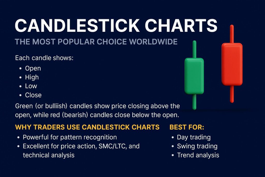
1. Candlestick Charts – The Most Popular Choice Worldwide
Candlestick charts are the industry standard for a reason—they give a complete visual representation of price in a simple, intuitive format.
Each candle shows:
- Open
- High
- Low
- Close
Green (or bullish) candles show price closing above the open, while red (bearish) candles close below the open.
Why Traders Use Candlestick Charts
- Powerful for pattern recognition
- Excellent for price action, SMC/LTC, and technical analysis
- Easy to identify reversals, continuations, and market sentiment
Best for:
- Day trading
- Swing trading
- Trend analysis
- Identifying liquidity sweeps, fair value gaps, mitigation, and order blocks
Time-Based vs Non-Time-Based Candles
Most traders use time-based charts such as:
- 1M
- 5M
- 15M
- 30M
- 1H
- 4H
- Daily
However, time is only one way to organize data. That leads us to alternative chart types like range and tick.
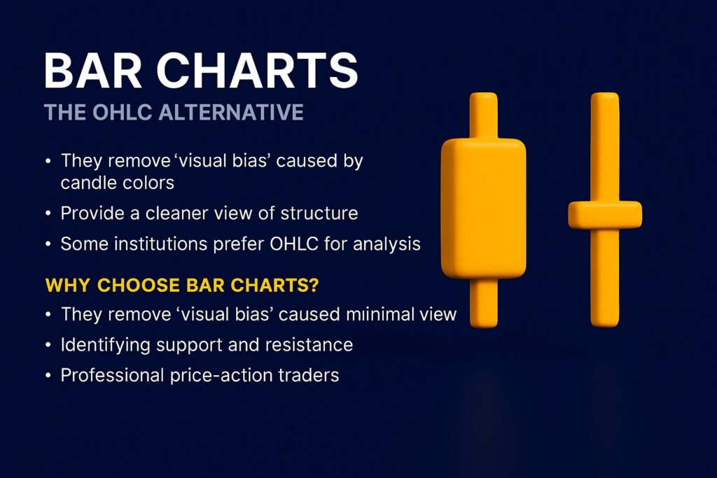
2. Bar Charts – The OHLC Alternative
Bar charts, also known as OHLC charts, show the same data as candlesticks but in a more minimal form. Instead of a candle body, they appear as simple bars with two small notches indicating open and close.
Why Choose Bar Charts?
- They remove “visual bias” caused by candle colors
- Provide a cleaner view of structure
- Some institutions prefer OHLC for analysis
Best for:
- Traders who want a clean, minimal view
- Identifying support and resistance
- Professional price-action traders
Candlesticks are more visually expressive, but bar charts offer clarity without distraction.
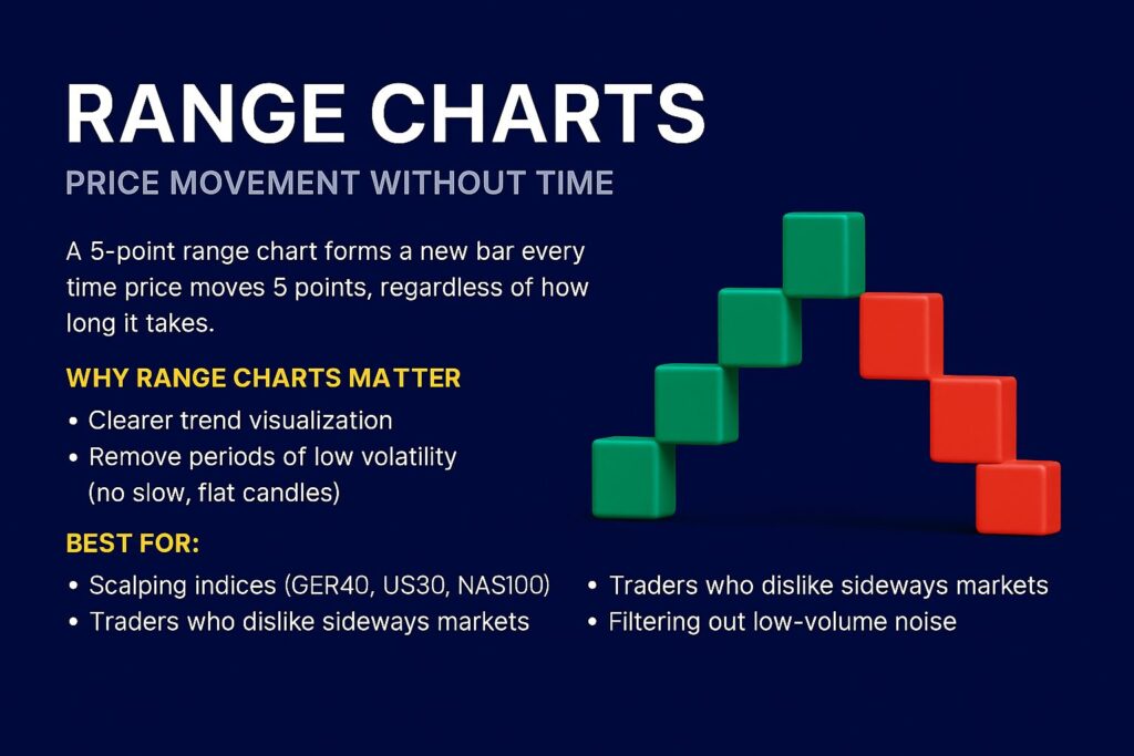
3. Range Charts – Price Movement Without Time
Range charts remove time completely. A new candle only prints when price moves a fixed number of points (range).
For example:
- A 5-point range chart forms a new bar every time price moves 5 points, regardless of how long it takes.
Why Range Charts Matter
- Clearer trend visualization
- Remove periods of low volatility (no slow, flat candles)
- Ideal for scalpers who want to avoid time-wasting consolidation periods
Best for:
- Scalping indices (GER40, US30, NAS100)
- Traders who dislike sideways markets
- Filtering out low-volume noise
Range charts help traders see the “true movement” of price without time distortion.
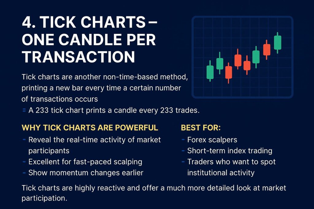
4. Tick Charts – One Candle per Transaction
Tick charts are a non-time-based chart type.
A new bar forms after a specific number of transactions occur.
Example:
- A 233 tick chart prints a candle every 233 trades.
Why Tick Charts Are Powerful
- Reveal the real-time activity of market participants
- Excellent for fast-paced scalping
- Show momentum changes earlier than time-based charts
Best for:
- Forex scalpers
- Short-term index trading
- Traders who want to spot institutional activity
Tick charts are highly reactive and offer a much more detailed look at market participation.
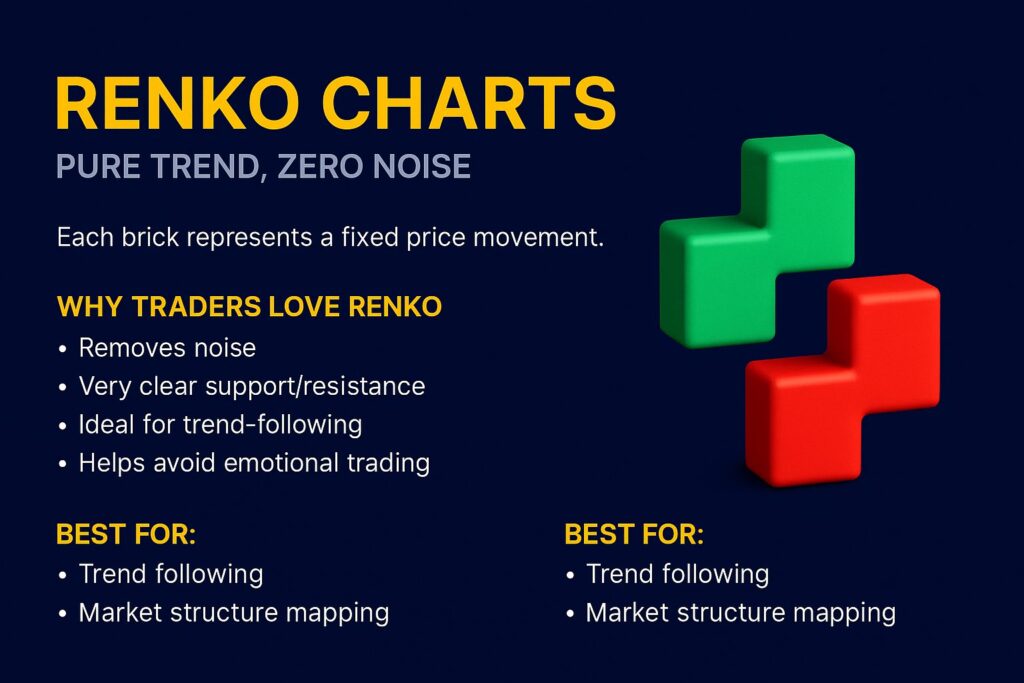
5. Renko Charts – Pure Trend, Zero Noise
Renko charts are one of the cleanest chart types available. Instead of candles, they display bricks—each brick represents a fixed price movement.
Example:
- A brick size of 5 pips means a new brick forms only when price moves 5 pips.
Why Traders Love Renko
- Almost no noise
- Very clear support/resistance
- Trend-following becomes extremely clean
- Helps avoid emotional trading
Renko charts eliminate most of the chop and focus only on meaningful market structure.
Best for:
- Trend following
- Identifying swing points
- Market structure mapping
- Traders who want simplicity
Renko is also great for beginners who struggle with over-analyzing charts.
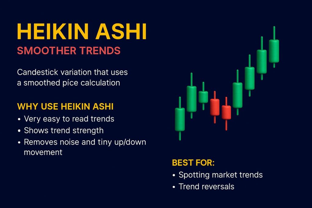
6. Heikin Ashi – The Chart That Smooths the Market
Heikin Ashi candles use a modified formula that averages price, smoothing out the market visually. The result? Trends appear cleaner and more consistent.
Advantages of Heikin Ashi
- Reduces noise
- Makes long trends easier to hold
- Helps avoid early exits and false reversals
Downside
- You lose some precision
- Exact highs/lows are not always accurate
- Not ideal for scalping
Best for:
- Trend-followers
- Swing traders
- Beginner traders who struggle with emotional exits
Heikin Ashi is excellent for spotting when a trend truly begins—and ends.
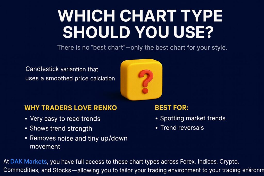
Which Chart Type Should You Use?
There is no “best chart”—only the best chart for your style.
| Trading Style | Recommended Chart Types |
| Scalping | Tick, Range, 1M Candles |
| Day Trading | 1M–15M Candlesticks, Range, Heikin Ashi |
| Swing Trading | 1H, 4H, Daily Candlesticks, Heikin Ashi |
| Trend Following | Heikin Ashi, Renko |
| Structure/SMC/Liquidity Trading | Candlesticks (gold standard) |
At DAK Markets, you have full access to these chart types across Forex, Indices, Crypto, Commodities, and Stocks—allowing you to tailor your trading environment to your strategy.
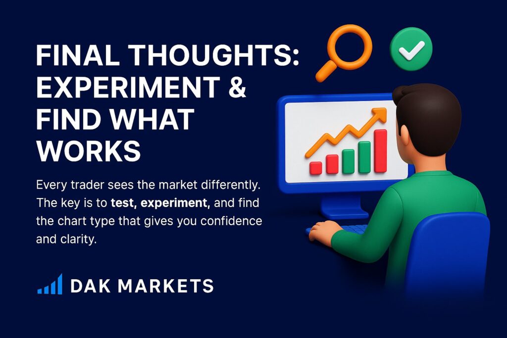
Final Thoughts: Experiment and Find What Works
Every trader sees the market differently. Some prefer the raw detail of tick charts, while others want the simplicity of Renko or the expressiveness of candlesticks. The key is to test, experiment, and find the chart type that gives you confidence and clarity.
DAK Markets provides institutional-grade charting and execution infrastructure so you can analyze markets the way professionals do—whether you’re trading gold (XAUUSD), GER40, NAS100, or major FX pairs.